Showing posts with label art. Show all posts

Tuesday, January 8, 2013

Rushing to Ruscha

I knew about Ed Ruscha's photographs and paintings, and his love affair with words, but never realized that the relationship extended to books until I caught his gallery show at Gagosian Gallery this January (through January 12).

Giant paintings of books, complete with marbled endpapers, gilded edges, worm holes...


Photo by Paul Ruscha

Photo by Paul Ruscha

Photo by Paul Ruscha


Also, constructions where paintings are combined with actual books (as object), as well as books that have been painted over, bleached out, and otherwise altered.


It's always interesting to see how artists expand their vocabulary (in this case, literally and figuratively), and it's terrific to see the depth and breadth of Ruscha's exploration and manipulation of the book (and the term "bookworks"!).

Monday, December 31, 2012

Kusama, redux/recall

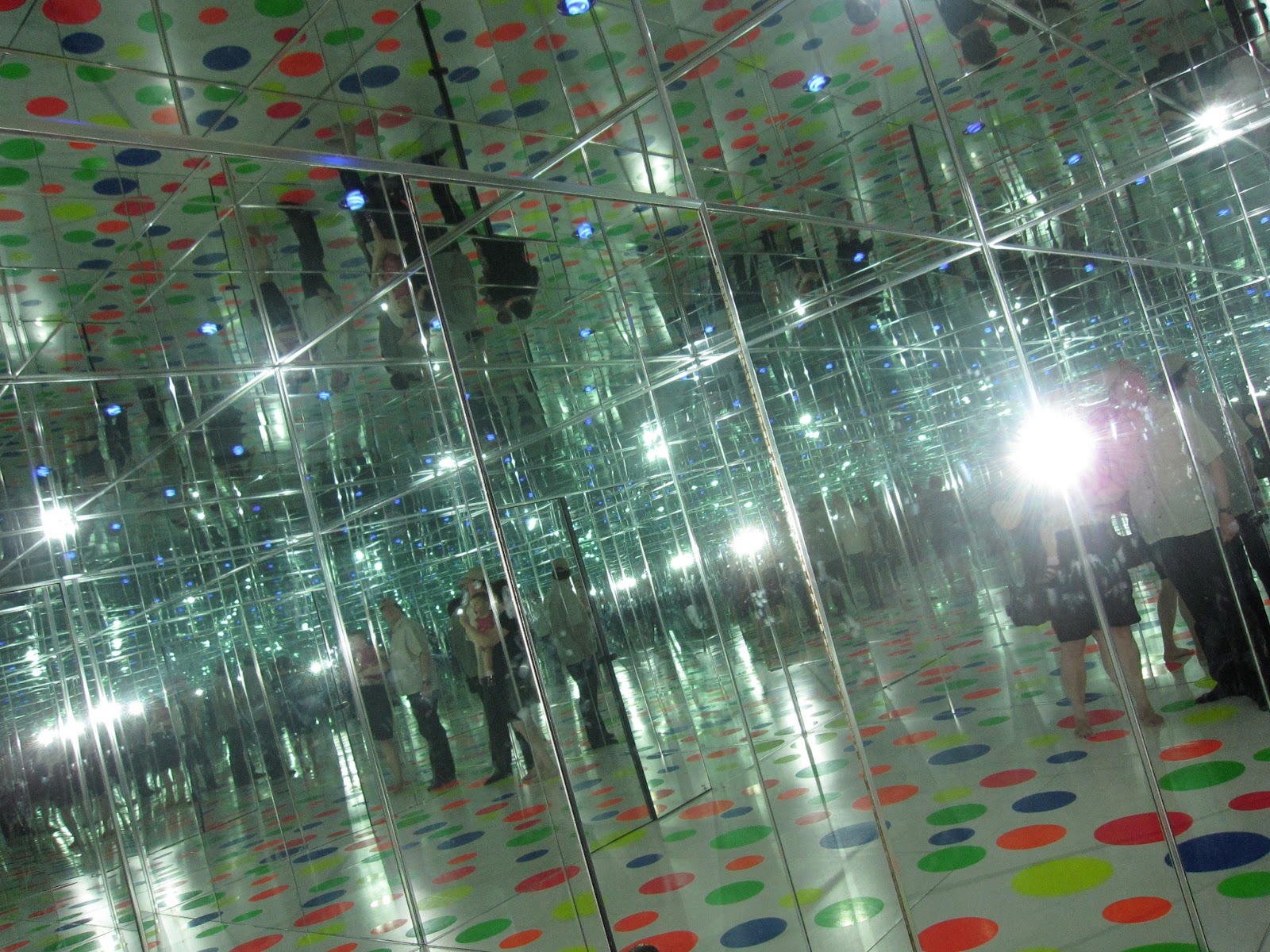
Last time we were in Pittsburgh on our way to Indiana, we stopped off at the ultra cool Mattress Factory, a museum that specializes in installation art.

They have a couple of rooms of Yayoi Kusama, and we took the appropriate (and practically mandatory) photos. I sincerely thought about going home and putting dots on everything. I'm sorry I missed the Whitney show you blogged about! You may notice we had to take off our shoes to enter the installations—I'm not sure if that was the artist's choice (very Japanese), or the museum's.


Sunday, July 22, 2012

Tree Gallery Project (a happening)

I was thrilled to be selected to have a solo show on Sunday, July 22 at the Tree Gallery Project at 108 Bowery.

The tree, a honey locust, arrived in late November of 2011, which inspired artist/gallerist/designer Kerry Stevens to host art happenings outside on the tree!

My series, "Accumulations" are handmade paper paintings based on direct observation of the landscape—the accumulation of leaves, plants, and algae on the surface of freshwater ponds.

I've been taking photographs of the pond surfaces for the last 2 years, and was wondering how to translate them into artwork. Drawing and painting didn't seem to get the integrity of the work across. Then I had my "aha moment" and I started to make handmade paper (made of plant material and water) to realize the pond formations. I pour handmade paper pulp into a screen in algae patterns, then put black paper pulp (as the surface of the water) on top, and then add more paper pulp to create a 2-sided artwork. Lots of great images and more information here!


Monday, October 17, 2011

Tuesday, November 2, 2010

Interview with a (very likeable) Smartypants

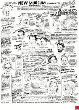
I am so impressed with this interview of the artist William Powhida by Paddy Johnson (aka the ArtFagCity blogger) that I simply have to repost it. Powhida is known as a bit of an artworld smart-ass, perhaps best known for his "How the New Museum Committed Suicide with Banality" for the November 2009 cover of the Brooklyn Rail. He also co-curated #class with Jennifer Dalton in 2010, which was a fascinating (and fantastically idiosyncratic) freeform event series in Winkleman Gallery in Chelsea (one of the events was one of my colleagues, Zoe Sheehan-Saldaña, gift-wrapping, in her handmade paper, things that gallery visitors randomly brought in).

Discussing everything from struggling to career shame, the interview is smart questions, even smarter answers.


Tuesday, September 21, 2010

Much Better Mapping

Mark Bradford, a 40-something painter, has a big show at Wexner Center for the Arts, and his map paintings are to die for.


Above: Giant, 2007. Mixed media collage on canvas, 102 x 144 inches 
Below: Los Moscos, 2004. Mixed media on canvas, 125 x 190 1/2 inches
Images courtesy Sikkema Jenkins & Co.


And the website...the website for the exhibition is ab-so-lutely spec-tacular. Designed by Resource Interactive, they have a short video about their inspiration.


Speaking of exhibition websites, blogger Tyler Green at Modern Art Notes has a fascinating (and short!) essay today about all the different variations that the online catalogs are sporting, since there is no codified style yet.

(A lot of worthwhile link reading/watching/interacting in here today!)

Thursday, September 9, 2010

Tuesday, August 31, 2010

Busted!

You know, this guy who makes shirts and sells them at the Union Square Market was insistent that I include him in the photograph of his merchandise when I shot him for this blog in late 2009. He said he didn't like people ripping off his stuff.


Well, in a recent perusal of the Saatchi Collection online, I spotted this artwork by Scott King from 2008! Who's ripping off who? Hmmm.


(Scott King. Pink Cher, 2008. Screenprint and paint on canvas, 300 x 200cm. Obviously, picture courtesy of The Saatchi Gallery.)

Tuesday, June 29, 2010

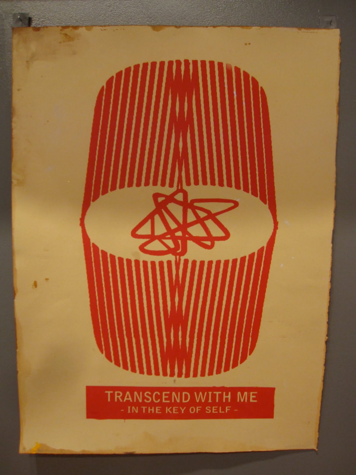
A Lower East Side Day, Transcend with Me.

We had some German friends/family in town who requested a gallery tour of the Lower East Side. A bit tricky, since the galleries are so much more spread out than in Chelsea, but we had a map and a plan. Lots of lovely type and design and art to be found.

Walking along East First Street (between First and Second), there is a lovely little restaurant called Arlo and Esme that sports a great and invitingly friendly sign.


We were on our way to La Mama La Galleria on East First Street to see the "To Believe" show that featured artists whose work reflects the supernatural, spiritual, and paranormal (great for these troubled times). I fell in love with the work (and type) on the work by Spiritual Tours (who are Dave Hardy and Siebren Versteeg).


I loved this piece by Bede Murphy with Unarius, part of a larger installation titled Universal Articulate Inter-Dimensional Understanding of Science.


Nearby, at Participant Gallery on East Houston, the art on view was inspired by the work of actor/director Timothy Carey, who was a pioneer of underground film in the early '60s. I'm thinking that this sign was a prop from his 1992 production of The Insect Trainer aka "Le Pet" from 1992. I am a total sucker for this kind of signage (does it have a name?).


Moving on over to Bowery, as an homage to a beautiful series of Bowery photographs that Beth did, I spotted and shot a picture of this incredibly handmade sign. You could almost miss it:


We kept on: at DCKT on Bowery we saw a fabulous installation by Ryan Humphrey titled Early American (the installation views are worth a click!). The show was a bit lost on the Germans, but the concept and follow through of this install was incredible. The artist had recreated a version of an 18th Century American interior complete with parlor, but totally did a smash up with garage and car culture and heavy metal. Here's a few shots of some of the "art" that was hanging on the wall in the remade interior.


Some very happy Germans at the end of the day!

Wednesday, June 23, 2010

Wednesday, June 2, 2010

Please don't play the piano, darling

A charming little note sits atop the artwork piano in this piece by Brent Green: Gravity Was Everywhere Back Then. Up only for another week at Andrew Edlin Gallery in Chelsea.


Top image, Suzanne Dell'Orto. Bottom image Andrew Edlin Gallery.

The artwork is an installation of a recreation of a house built by Leonard Wood, who kept building and building his house in the hopes that it would cure his wife.


Fascinating installation, and video installations features some music by the Sacred Harp Singers At Liberty Church (who are Shape-Note singers, fascinating if you don't know about it, click this link).
One of their songs appears on the Cold Mountain soundtrack.

Tuesday, May 11, 2010

Chelsea Gallery Jaunt: Joan Linder

Had a chance to see the Joan Linder show at Mixed Greens. Unbelievable...the artist has hand drawn all her mail and the contents of her desk...down to the patterning inside the envelopes.


Monday, April 19, 2010

Days and hours of work

Speaking of hand skills as we were . . . the ultimate moment in art/design made by hand is at The Morgan Library & Museum where "Demons and Devotion," an exhibit about The Hours of Catherine of Cleves, is on display through May 2. The Master of Catherine of Cleves created other manuscripts, but he's most famous for Catherine's book (I have yet to learn if he had his own real name). The Master must have had infinite patience—or assistants—to make so many pages with such extraordinary detail. The Hours is astonishing, humbling, and inspiring. Each page is full of symbols as well as domestic scenes that paint a clear picture of 15th century life in the Netherlands.


The surprise for me in this charming scene of the Holy Family at Work is the cool baby-walker.

If you can't get to the Morgan, have an online look at curator Roger Wieck's rich and witty interactive tour of The Hours. . . . The section named "Suffrages" contains the most delightful scenes (a fish border painted on silver foil is an early multi-media presentation).

On the page for St. Lawrence, the afore-mentioned fish appear in the border, while a well-prepared saint brings his own grill (actually, the grill is not for the fish but to signify the instrument of St. Lawrence's martyrdom). The video enables you to see the work close up as opposed to leaning over the vitrines and trying not to either break or fog up the display.

Catherine was quite the tough dame; she spent most of her life warring with her husband. Wieck points out that Catherine committed a heraldic no-no when she incorporated her father's—instead of her husband's—crest into one of the illustrations. No one was the boss of her. I wonder how much say The Master of Catherine of Cleves had about his rather major contribution to the book. Of course, the times warranted various strictures and structures aside from the wishes of the "client." My guess is that the Master didn't have a lot of freedom. Was Catherine a demon about her book of devotions?


Curator Wieck is particularly droll when describing the image above. Note the scrolls of sacred conversation.

Images are screenshots from the Morgan's site.

Wednesday, April 7, 2010

Peep Sushi!

We've all seen the peeps in the microwave, and checked out the peep diorama contest in the Washington Post, but have you ever seen peep sushi (also known as Peepushi)? The rice is Rice Krispie treats, and the nori is fruit leather.


Brilliant! Conceived and created by Russ Marchand, who is the self-proclaimed child of Wink Martindale and the Devil!


Thanks to Noah Dziobecki for sending.

Sunday, April 4, 2010

Identify that typeface

While we're on the subject of art (brilliant woman, BTW, that Andrea Deszö!), there's something I quite liked about this art invitation at the Observatory Room; obviously some of the typography could have been better, but I like the type choices (Garamond, Caslon, Letter Gothic), and the overall concept. But what is the typeface for "Entymologia"? Closes today, and sadly I didn't quite make it out to Brooklyn to see it.


In other art invite news, I loved the concept for this group show, using a diagram showing the parts of a robin for the names of the artists in the Round Robin Collective.