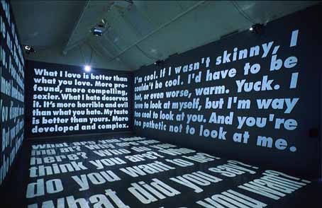
I was able to catch one of the last days of the
Jenny Holzer show "Protect Protect" at the Whitney Museum on Saturday.There was a lot to think about. She installed a new(ish) piece, an LED ticker on the floor with choreographed text running up, down, backwards, jumping, and blinking that encompasses all her past writing, so 12 tickers running for 2 hours will let you read it all.

She also had installed a room of "paintings" that are really silkscreens of declassified (and redacted) documents from the U.S. Government pertaining to the Iraq War. Some of them are maps, some of them are court documents pertaining to torture trials, some of them are declassified (and redacted) handprints.

I found myself thinking about Paula Scher. Both found that images got in the way of the message, and decided to focus more on the text. Holzer obviously wants the LED tickers to be pretty and seductive, and to draw you in to reading the messages. Same with the "paintings". She worked collaboratively, so she doesn't do the coding, the painting, or the silkscreening.
I hate to say it, but, jeez this was a Boomer show. A lot of the early writing was about love and identity and breaking up; later stuff seemed like a guilt purge of the Vietnam generation letting it happen all over again. And there's more. I know I've mentioned that I even though I think they're beautiful and clever successful and massively-scaled, I don't really feel that Paula Scher adds anything to the art conversation with her text maps in the same powerful way that her graphic design moved the graphic design conversation along.

I think the same thing about Jenny Holzer. That LED idea was massive and a great conceptual leap forward, but what she's done with it only aligns her with Dan Flavin (light pieces changing the architecture),

and LED boxes and grids that echo Donald Judd's forms.

The silkscreen "paintings" align her with Warhol and even the color field painters, but while they call back to the past, they don't move along in the future.
Meanwhile, I started to wonder what the difference really is between Holzer and Barbara Kruger . . . is there always a Pepsi to a Coke?

Or worse—a Braque to a Picasso? Or even worse—an Alfred Russel Wallace to a Charles Darwin?