Showing posts with label signage. Show all posts

Wednesday, September 23, 2015

The beauty of Amsterdam

I often joke with my students that I'm a nightmare to travel with because I'm always taking shots of typography to share with them! In Amsterdam, I was delighted by the gorgeous hand painted script faces:


Idiosyncratic stacking:


Fresh use of Helvetica:


And this... an undeniably gorgeous tweak on Garamond for the signage for the Plantage district, designed by Dijkhuis+Dijkstra. (And is that Eric Spiekermann's ubiquitous Meta typeface there for the text?)


Monday, November 5, 2012

Recharge

Speaking of power, I'm loving this sign that went up after the storm at our neighborhood Episcopal Church, especially the double entendre of "recharge".


Tuesday, November 8, 2011

Sunday, September 4, 2011

The New Jersey Firemen's Home

Every year on Labor Day weekend Boonton, NJ there is the Boonton Fire Department Labor Day Fair, a.k.a. The Boonton Labor Day Carnival, complete with pig roast, beer tent, rides, junk food, zeppole, and games.

Also in Boonton over on Lathrop Avenue surrounded by a beautiful stone fence, there is the New Jersey's Firemen's Home (no mention of what to do with the Firewomen) for retired Firemen. Inside there is also a cool firefighting museum. But the coolest thing about the NJ Firemen's Home...? The gate and it's fantastic metal lettering.


Happy Labor Day. And thanks, firefighters.

Thursday, May 19, 2011

More Louisiana-ana

Some more New Orleans . . . this handlettering was painted directly on the glass panes of the saloon door (well, to be precise it was actually painted on the inside of the door backwards).


Monday, May 16, 2011

Restaurant Signage: New Orleans Edition

I have a lot of shots of beautiful restaurant signage from New Orleans. So without further ado, here are Felix's Sea Foods, Galatoires, and Sylvain:


Sunday, May 15, 2011

The Chandelier

In Belleville, NJ there still exists a classic Italian catering hall called The Chandelier (notice the great scrip logo/signage of the hall itself, and also note the very au courant slab serif in the website).

Here is one of their actual chandeliers, taken by a pint-sized photographer who managed to grab the camera for a moment:


The hall also features a pretty awesome restroom sign, a specialty of this blog, I think.

Saturday, April 16, 2011

Cheers!

Outside of an office park somewhere outside London, there is this:


Depending on your worldview it is either an uplifting goal, or a demoralizing co-opt of an idea that is, in itself, an oxymoron. You decide.

P.S. I'm pretty sure they've used Bell Centennial, designed by Matthew Carter for use in the phone book. A lot more people are using that lately. The tipoff is those little cutouts where the Ns diagonal stroke joins the stems.

And P.P.S. I'm told by a British friend that Chiswick is pronounced "chissick", with a silent W. I was also told that Chiswick is very "swish".

Monday, January 3, 2011

"Hush"-ering in the New Year

NJ Transit is now reserving the first and last cars of trains into Penn Station during peak hours as "Quiet Cars." Sshhh! They even come with their own logo, playing on the tail of the Q and putting the mute in commute.

Thursday, December 23, 2010

Let it $now!

Happy holidays...
This fabulous window display is at the antique shop The Lively Set over on Bedford Street. The "O" in Noel is one of 2 original Woolworth's signage O's. Only $1200 for the pair, Santa dear!

Wednesday, December 22, 2010

Please don't enter

By the time you read this sign, I'm guessing you will already have run into the hospital. Maybe not the best design, eh?

Sunday, October 31, 2010

Boo Haiku

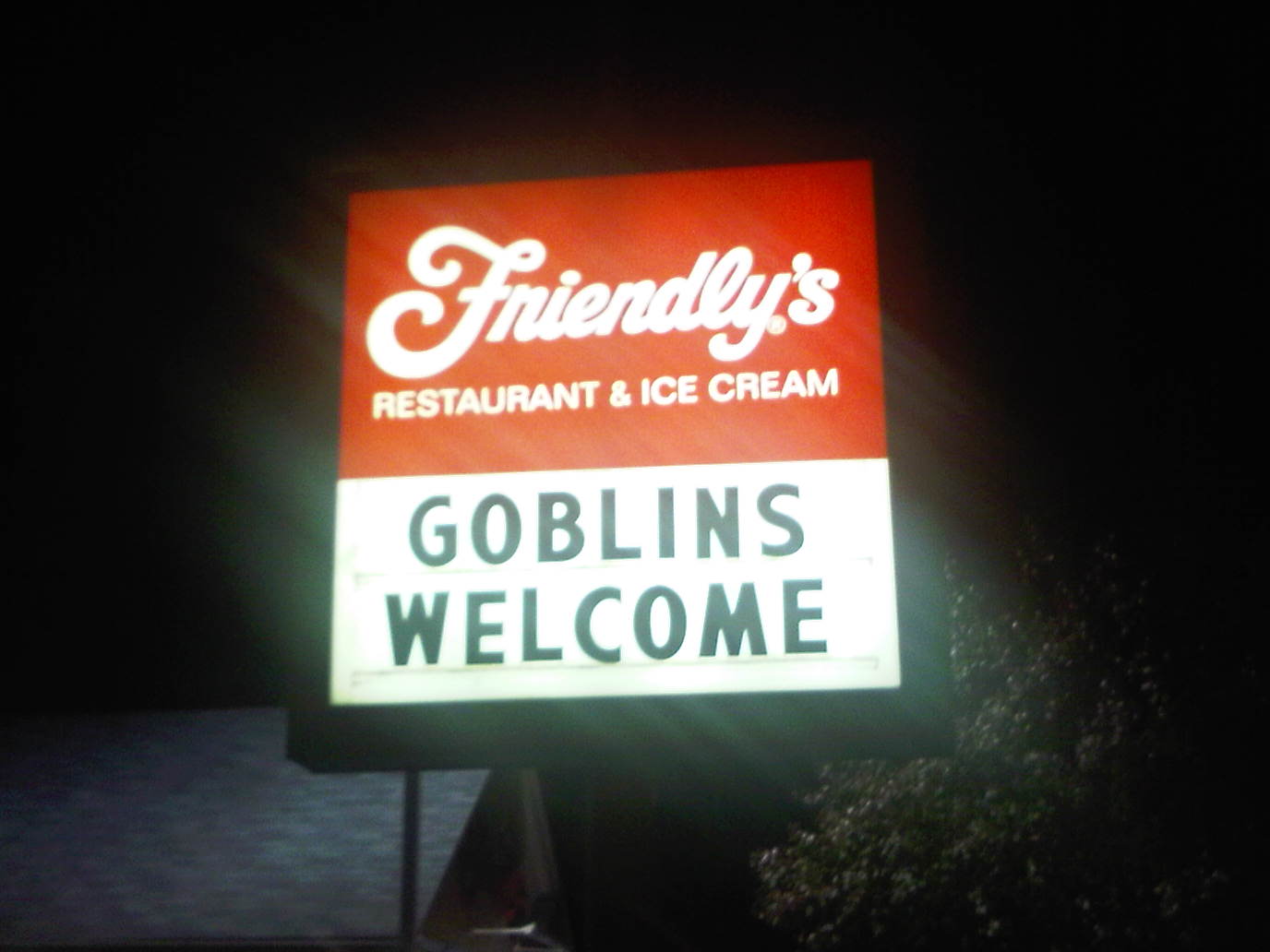
This sign may be short-lived at the neighborhood Friendly's. I'm wondering (horror movie style) what would really happen if real goblins showed up for ice cream.

Thursday, October 21, 2010

J

In the continuing poem that is our Friendly's sign...


But what is the mysterious J?
Some friends have already posited jalapeno, or perhaps jack?

Friday, September 17, 2010

Shampoo Bubbles

On a recent trip to Washington, DC, I spotted some great signage for the Glynn Jones Salon (no, not Glynis Johns...and not my old housemate Glen Jones) in Alexandria, Va.

It's a great example of simplicity: two colors (plus white) and two typefaces. And the use of an italic (in this case Helvetica Bold Italic) is a nice change from the usual. If this was one of my student's designs for a logo, they'd get an A!

Bonus points for naming the typeface at the bottom for hair/color/style/spa, which is on the tip of my tongue...grrr!

Wednesday, September 8, 2010

Retro fancy

When I was a kid, I thought this furniture store in Montclair, NJ was the epitome of fanciness. That when I achieved Ann-Margret baked bean adult status that I would shop for all my furniture here.

On a recent trip back with my friends Sarah (a NJ transplant) and Tom Pluck (NJ native and fellow blogger), the Hampton House sign remains as evocative as ever.

Sunday, August 29, 2010

Funnel Ball

The playground near our house has a Funnel Ball setup...I've never played, have you? You throw the ball up in the cup and it will spin around and come out randomly through one of the 4 exits. The holes score points (2, 4, 6, and 8 points).

In any case, it's got some beautiful lettering on it, and has a beautiful shape.

Saturday, August 28, 2010