Wednesday, March 31, 2010

School Colors


I recently attended an event designed to boost alumni participation in uPenn's reunion and fund-raising efforts. Attendees heard a lot of interesting statistics—and were bribed (in the nicest way) with a few meals, some of which had touches of the school colors. The red and blue corn chips cracked me up.

Tuesday, March 30, 2010

The real nature of art

Had the opportunity to check out a bunch of gallery openings a few weeks ago. Here is my editorial, speaking of staying power and calls of nature.

Monday, March 29, 2010

Marking Time


A quick zip through MoMA to see William Kentridge yielded a side show (almost literally) of Marina Abramovic staring down a few intrepid museum-goers. White shirt red sneakers lasted a while. Green shoes didn't last very long at all. And white shirt with black and white scarf seemed to have staying power. The guards told my friend Kay and me that the longest Mano à Marina has lasted for seven hours (as of Sunday aft, March 28); he wouldn't divulge how the artist deals with the call of nature. Kay, whose eagle-eye serves her well in many capacities, noted that the tag to Ms. Abramovic's shirt was showing, but we dared not dash up to helpfully tuck it in. Just as I finished saying, "I don't see any 'No Photos' signs," a different guard busted me. Here are my shh-don't-tell shotss of a well-recorded performance piece.

Sunday, March 28, 2010

Answer (of sorts) To "Use Other Phone"


When signs mislead the user, some helpful, enterprising, and just plain frustrated people take communication into their own hands. The word-processed "THE HAND DRYERS ARE AUTOMATIC" taped onto a machine in Grand Central Terminal begged for the hand-written rejoinders "Doesn't work Get paper" and "Same for other one" and the most succint "Doesn't Fucking Work." The hand-drawn emoticons are my favorite touches.

Saturday, March 27, 2010

Venetian Elections

It's a bit unfair, I know, to so quickly post another photo from the blog Venice Daily Photo, but this had to be seen. Apparently, this gentleman is running for office. The poster is fascinating! What is that book!? A cape in an election photo! And doesn't he just look like he's on his way to opera rehearsal?! Is it me, or are you getting an Orson Welles/Third Man vibe off of this guy?

Thursday, March 25, 2010

Dirty Water

I've got my students making some packaging for a project this month. Meanwhile, taking a walk minding my own business, I spy this new beverage in a shop window with some compelling packaging.


This concoction is Dirty Water, which turns out to be tea. The blurb says that if "you drink this Dirty Water, a child will have access to safe, clean water for a whole year."

The website is less clear about what to do, but it's an interesting concept nonetheless. An informal poll of my class indicates that teenagers like to drink gross looking stuff. Especially ones with a cause.

Wednesday, March 24, 2010

This Means Uh-oh

Something that may be helpful for your semiotics lecture is the book,This Means This, That Means That: A User's Guide to Semiotics, that Donna David recommended to students during her lecture on Communication Theory and Semiotics. Would that I'd known about the book before BTD contributed a logo to a professional organization last Spring. Recently, the org's current president diplomatically posed a problem: the logo is inciting unfortunate responses. Although an implied Rorschach was intentional, other interpretations were unexpected. Members of the org use words such as "jester," "whimsy," and "Groucho Marx" to describe their interpretations of the logo. Maybe extreme abstracting has become majorly distracting. Possibly, the problem is more executional than conceptual. Next step: review and rework. In the meantime, I'm keen to know your take on the no-go logo below.

Floral Encore


My close-ups from November 2009 of the same store are little picture details to your big picture shot. "Velties" looks more like a sign for fish instead of novelties. Who knows? With the area becoming so chic, the store could morph into a sushi bar.

Flower District

From 27th Street and 29th Street between 6th Avenue and 8th Avenue in Manhattan is known as the Flower District, but much of the flower businesses are going away due to high rents and rezoning. But there is still a lot of beautiful window signage to be found.

Tuesday, March 23, 2010

Starring Werner Herzog as a Plastic Bag

This wonderful video directed by Ramin Bahrani is making it's way along the internet this morning (via kottke, via greg, via mrdanzak).

Voiced by Werner Herzog (one of my all-time fave writer/directors and a fascinating narrator in many of his films. Also secretly, one of my best celebrity impressions).
As Kottke said,

"I didn't know it until just now, but I had been waiting all my life to watch a short film featuring Werner Herzog voicing a plastic shopping bag."

Agreed. 18 minutes long and worth it.

Speaks a bit to layering, I think.

Monday, March 22, 2010

Layering

While out and about, I noticed layers NOT in Photoshop or InDesign.

The St. Patrick's Day "display" at one ticket booth in the Port Authority subway station shows a few layers of good wishes.

A hoarding on the ever-gentrifying Bowery superimposes a drawn natural world over construction permits.

Again on the Bowery, a former Hershey's sign became the sign for Marian's and now announces Dumbo Hecho. I think that makes the original sign threecycled. If you look very closely, you can see the three-dimensional "Hershey's."

Sunday, March 21, 2010

Hexing the hex

Derek Larson, a Seattle artist working in a variety of media (including video), had an interesting piece up at Louis V E.S.P. in Brooklyn, that subverted a Pennsylvania Dutch Hex Sign. I've been working on expanding my semiotics lecture, and this piece just has iconography in spades. A lot of his work seems to be about subverting signs and messages, so this fits right in. I'm sorry the show closed so soon.
 

Saturday, March 20, 2010

Love among the trees

Some "classic" signage/grafitti found among the trees in the Frelinghuysen Arboritum, a lovely horticultural park in Morris County. I always wonder if these couples are still together.


Friday, March 19, 2010

HairlessHairlessHairlessHairless


My guess is that no one thought the Hirschfeld Theatre—current home of the musical "Hair"—would be a party to one of Broadway's funnier (if unintended, not to mention subtle) visual puns. Hirschfeld's head-as-inkwell/mind-as-a-font-of-ideas could also be read as Hirschfeld painting hair onto his bald pate. Alas, there are no Ninas to count.

Thursday, March 18, 2010

Please use other phone

Not that there is a pay phone in sight of this helpful markered-in sign. Perhaps it should tell you to use your own cell phone.

P.S. "The pull" on the side of this phonebox is also vertical, and continues to make the case about why not to use vertical type. As Ellen Lupton says, "English is not Chinese".

Wednesday, March 17, 2010

Pull


This door pull from a Thai restaurant gives a clear reason for NOT stacking type vertically. I knew what the handle meant, but because we know a Thai person name Pui, I thought of her first.

Monday, March 15, 2010

Modern Ancients


Don't you just love the headline "Modern Ancients" and how it covers so many things? Because we were talking about type (and trashing Trajan), I dug out a tee that I picked up at Type 90 in Oxford in 1990 (that would be "back in the day") when the typeface Trajan was oh so very new.

Saturday, March 13, 2010

Wedding Invite, German Style

Forgive the awful jpeg, but I was so interested to see this wedding invite we got from some German in-laws (via email). So very much different than American invitations...hardly any script faces!
Sadly, I don't think we can make it. And the location is so close to Mainz, too...could have had a whole tour of Gutenberg's invention of moveable type in 1455!

Friday, March 12, 2010

Medium is the Message

To help me understand how good teachers connect with students and therefore more successfully educate, inspire, and instill etc, I set up for myself an ongoing series of observing teachers in the classroom. Yesterday, I observed Donna David in her Visual Process class at FIT. She gave a lecture in communication theory and semiotics. I found the lecture fascinating (and I don't mean "fascinating" in the sense that "I'm angry but don't want to be negative so I'll use 'fascinating'"). It was a rich few hours.

I was struck by many things about the class (more observations to come—including the fact that movement and comfort are forms of semiotics), but what I want to mention here is a student's reaction to a radioactive hazard symbol and a site that Donna showed to expand her discussion of the radioactive symbol. The message was urgent, but a student commented, "Who wrote this site? I can't even take it seriously because of the way it looks."

The comment made me think of your student, whose enjoyment of the movie "Avatar" was ruined by the sub-titles in Papyrus. The sub-titles didn't bother me (hack? blown away by those 3-D seeds?) possibly because "Avatar" is really a Papyrus-kind-of-a-movie to me. In the case of the nuclear waste, the reaction is more arresting and troubling. The medium is the message (and massage). Form is the new content (I stole the afore-written phrase).

In a way, form is not news. The medium became the message when Marshall McLuhan and designer Quentin Fiore wrote The Medium is the Massage in 1967, using McLuhan's catchphrase. Now, it's a faster message—and massage.

A side note: oddly, my online search for "Nuclear Waste Fields" in an attempt to find the url for the site the student found so ugly also calls up sidebars for Albuquerque B&Bs.

Venice Daily Photo...Gondola Pasta

The blogsite Venice Daily Photo had a great shot of some strange looking pasta...in the shape of gondolas (or correctly pluralized, gondole).

If you don't blog feed this site, I recommend it. A little slice of La Serenissima every day!

Thursday, March 11, 2010

Don't Worry; be prepared


This was the perfect bit of found type to see after a week which included summits n' seminars about eBooks and the evolution of books into . . . ?

Ab Ex Stamps

Today (March 11, 2010), the Postal Service will issue a 44–cent, Abstract Expressionists commemorative stamps.


In celebration of the abstract expressionist artists of the 20th Century, Art Director Ethel Kessler and noted Art Historian Jonathan Fineberg (Gutgsell Professor Art History, University of Illinois at Urbana–Champaign) selected ten paintings. Kessler used elements from Barnett Newman’s Achilles (1952) to frame the stamps.

Gotta get some!

Wednesday, March 10, 2010

Bike Theft

The NYTimes ran a great story on March 9 about bike stealing in the age of Twitter...once your bike is stolen you can alert a whole bunch of people about it! This messenger got his bike back on the same day! Wish I had this 3 bikes ago!

Tuesday, March 9, 2010

More Bathrooms

Not so much about functionality, but how funny are we that we are busting our cameras out in bathrooms! Your picture reminded me that I took a photo of the bathrooms inside Bouley restaurant when I went in November for their fabulous prix-fixe lunch. The tiles and the light fixture were so pretty!


I've taken a potty shot as recently as last week! I took this photo of the bathroom door at the Indian restaurant Vatan. (has sound)

Monday, March 8, 2010

Ruffles


It's the day after the Oscars and you'd think I'd be talking about ruffles, drapes, pleats, and flounces on gowns—not to mention the miracle that kept all high-heeled stars from tripping on their swaths of material and tumbling down the stairs. BUT the ruffles I want to point out are on the mirrors in the Women's Room at Grand Central Station. I'm confused about why the mirrors are so decoratively scalloped when the rest of the fixtures are stainless steel functional (OK, so the soap dispensers aren't really functional; they drip and leak, hence the goldenrod towels under each dispenser).

For the record, one of my fave dresses was the Donna Karan gown worn by Penelope Cruz despite the fact that in some photos, the dress seemed to exist in a world outside of its fabulous wearer.

Saturday, March 6, 2010

Pudding, Cupcakes, Mad Hatter's Tea Party


Tim Burton's Alice in Wonderland opened this weekend and from what I've read so far, it may not be as big a hit as the show at MoMA, which has been packing them in. Tim Burton can sure draw a crowd—but wacky, scary, bizaare, or not, Burton really can draw. Beautifully. I plan to go to the show again just to see the film he made as his graduation project from Cal Arts (something about the Celery Stalker slays me) Another fave is an ink drawing of a garret, done for the movie Sweeney Todd. Lovely and simple, it awaits Depp and blood.

Screen shot is from the MoMA site

Friday, March 5, 2010

Hasty Pudding


Trader Joe's often has nice and evocative packaging, but this pudding box design makes even the vanilla look fun!

Thursday, March 4, 2010

Sushi Cupcakes


Amazing! Created by a blogger on NotSoHumblePie.blogspot.com!

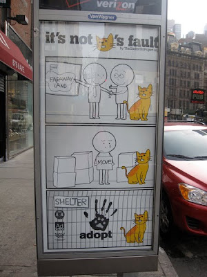
Adopt a pet


More cartoons!

I spotted this Ad Council/The Shelter Pet Project ad for adopting animals from shelters, with a bit of a switch-up for the message. It shows someone moving away to a "faraway land" who has to leave their pet behind, meaning that many lovely (and loved) pets wind up in shelters (as opposed to dangerous or street animals?), so why not adopt one.

It kindof has word balloons!?

The logo is quite nice, with a white animal paw print knocking out of a black human hand print, and their website is extremely interactive.

But yeah, if you get a pet, get one from a shelter, not from a pet store.

Wednesday, March 3, 2010

The Dark (graphic) Heart of Italy

While we're (or I'm) on Toons, I've been meaning to note a few examples of the goofy graphics Pat and I saw in Italy. Of course, I have many shots of gorgeous typography—the sort of letterforms epitomized by the gifted and gracious Louise Fili and the deleriously-funny graphic genius Matteo Bologna. In contrast, my observations are more, well, "rustica." They're not beautiful, but they make me smile (or laugh— but I hope not in a sniffy-snooty condescending way).


Some fave quirky souvenirs of our trip are the plastic raincoats that sold like hotcakes (insert Italian idiomatic phrase) when the opera was rained out. I think of opera as rarefied; Italians think of it as a way of life. So possibly, the cartoonish raincoats are a seamless combo of high and low.


As for an ersatz academic explantion for the napkin? Beats me.

*The Dark Heart of Italy is the book by Tobias Jones (no, not Tobias Frere-Jones the type designer, but the English writer who emigrated from the UK to Parma, Italy) that Suz gave me for C'mas a while back.

Napkin photo by Pat O'Neill

Tuesday, March 2, 2010

Tote that...tote?

Strangely enough, today I received 2 emails for 2 different contests for designing tote bags. One is for Print Magazine (submissions due March 15, with all proceeds going to the designer's selected charity.


The other is for the beloved Strand (18 miles of books) Bookstore. This one is more of a contest, with a first, second, and third place winner. (What do you win? Books!). Submissions started March 1.


I'm sensing that this tote bag stuff is a trend, like your balloon spotting!

Monday, March 1, 2010

Toons & Sculptoonists


More speech bubbles. . . and snow sculptures spotted near Tarrytown's (The) Historical Society, Inc.