Showing posts with label typography. Show all posts

Tuesday, September 22, 2015

Spelling Shakespeare and an "E" for Economics


An article by Dennis Drabelle in uPenn's alumni magazine, The Pennsylvania Gazette, about so-called polymath Victorian collector Horace Howard Furness includes a cool bit of typographical reason for why the Philadelphia Shakspere Society spelled the Bard's name without an "e" between the "k" and the "s."
(Re the name: Penn English professors Margreta de Grazia and Peter Stallybrass, in a 1993 article in Shakespeare Quarterly, note that no two of the Bard’s six surviving “supposed autographs” are spelled the same way—but none of them include an e between the surname’s two syllables. 
The e may well have been inserted by printers to avoid setting a k before an s—the long s of the period, that is, which looks like an f—because the two letters would crowd each other and were apt to break during the printing process. “To avoid breakage (and the ensuing fine),” de Grazia and Stallybrass explain, “a compositor would set a neutral typebody between k and long s”—sometimes a hyphen, sometimes an e. Thus, today’s received spelling “is not that of the author’s hand but that of the printer’s press and reflects not a personal investment in the question of identity but rather an economic use in the preservation of typeface.”)
Like so many things, the added "e" is a matter of economics.

A bit of nerdy explanation of the example I set of Shakespeare's name in roman and italic at the top of this squib: it's in Bembo, an Old Style typeface. Of course, the Bembo my office owns is not at all the face that printers would have used back in the day. The Bembo shown here is digital as opposed to the hot metal that printers needed to keep from getting banged up. But Bembo historically closer to the 17th century images shown here from Penn's library site (top image; 1623; look at the "s" characters which look like "f"s) as well as from a PDF from the librarians at the University of Delaware (bottom image; 1634; same comment about the "f"-like "s" characters).

• • •

* Notes regarding the two title pages from just two of the many works by William Shakespeare, 1564–1616.
The title page from the University of Pennsylvania is Mr. VVilliam Shakespeares comedies, histories, & tragedies : published according to the true originall copies. London: Printed by Isaac Iaggard, and Ed. Blount, 1623. In Horace Howard Furness Memorial (Shakespeare) Library. Folio PR2751 .A1.
And the title page from the University of Delaware is, according to the PDF from the university's library, is "A rare early quarto edition of a play by William Shakespeare and John Fletchr entitled The Two Noble Kinsmen (London: by Tho. Cotes, for John Waterson, 1634). Special Collections, University of Delaware Library.

** Why not Caslon, so often used to evoke earlier English settings? Because Caslon's transitional typeface would have been a bit too late to look like these two title pages from 1623 and 1634. William Caslon was born in 1692/93.

Monday, May 5, 2014

Marville-ous

The now-closed Charles Marville Exhibit at The Metropolitan Museum of Art was fascinating for a number of reasons. Paris's history is a big enough reason. But in addition to photos of a city in transition from a medieval to grand thanks to Georges-Eugene Haussmann, the proto-Robert Moses of Paris, the exhibit also shows early versions of today's media—including reinvention, selfies, and integrated displays.

In my random connections below, the material in quotes is from The Met's wall text. The images are screenshots from the Metropolitan Museum's website.

Reinvention
Born in 1813 with an unfortunate name ("Bossu," which means "hunchback" in French), Marville remade himself by changing his surname when he was around 19 years old.

Photo: a selfie from 1851.


19th-century Instagram-equivalent

The Metropolitan's wall text notes that, “About 1854, buoyed by his financial success, Marville moved to more spacious lodgings in an upscale neighborhood” and continues, “. . . the carefully-staged view of the impressive interior, lined with Marville’s own photographs, acts as a form of professional self-definition, announcing the artist’s stature and celebrating his accomplishments.” The photo of his studio calls to mind what we do on Instagram these days to announce our latest creations, observations, or achievements.

No photo; the image is so light-sensitive that in the exhibit, it was covered by a liftable cloth.

Adjusting reality

In the 19th century, skies were difficult to capture because photographic emulsions were not equally sensitive to all colors of the spectrum. "Some photographers painted clouds on the negatives. Other photographers made two negatives—one for the landscape and another, faster exposure for the sky—that were printed as a single image." In the mid-1850s, Marville   experimented with sky photos as eventually produced some of the earliest successful sky and cloud images. Did he or didn't he? The question remains whether Marville made the sky photos "in camera" or manipulated the shots after the fact.

Putting all forms of information on one device.
Messy posters all over the place were controlled by a structure devised by Morris Cie. to bring order to the chaos of posters all over walls and buildings throughout the city. All ads on one device! The columns are interesting, but nothing beats the gorgeous typography in the pre-perfected Paris.


Beautiful typography
Many of today's bistros—Balthazar, Pastis, you name it—are homages to Parisian typography. 


Wednesday, June 13, 2012

Berthold Type Foundry

On a recent trip to Berlin, my very thoughtful mother-in-law snapped this shot of the H. Berthold AG Type Foundry building for me.


H. Berthold A.G. was one of the largest and most successful type foundries in the world for most of the modern typographic era. It was established in 1958 by Hermann Berthold. It made the transition from foundry type (hot metal type) to cold type successfully before calling it quits in the digital type era in 1993.


Above image from Ethan Allen Smith, a blog with a great article on Akzidenz-Grotesk complete with detailed photos...worth a look!


The foundry's most celebrated family of typefaces is arguably Akzidenz-Grotesk (released 1896), an early sans-serif which inspired neo-grotesque faces such as Helvetica (designed by Max Miedinger with Eduard Hoffmann, 1957), Folio (designed by Konrad Bauer and Walter Baum, 1957), and Univers (designed by Adrian Frutiger, 1954).

Here are some Wikipedia images that show the differences between the characters of those 4 typefaces, and a comparison of the x-height of Helvetica to Akzidenz-Grotesk.


In 1950, type designer Günter Gerhard Lange embarked upon a long affiliation with the company, for which he designed various original typefaces, including Concorde and Imago, and oversaw the foundry's revivals of classic faces such as Garamond, Caslon, Baskerville, and Bodoni.

Thanks, as always, to Wikipedia for concise information.


Wednesday, June 6, 2012

Steve Jobs on typography

This summer I've been reading Steve Jobs by Walter Isaacson, so I'm inspired to post some of the more interesting quotes regarding design that I've found.


Here's Steve Jobs talking about typography:

"The minute I dropped out [of Reed College] I could stop taking the required classes that didn't interest me, and begin dropping in on the ones that looked interesting," he said.
Among them was a calligraphy class that appealed to him after he saw posters on campus that were beautifully drawn. "I learned about serif and sans serif typefaces, about varying the amount of space between different letter combinations, about what makes great typography great. It was beautiful, historical, artistically subtle in a way that science can't capture, and I found it fascinating."
...."If I had never dropped in on that single course in college, the Mac would never had multiple typefaces or proportionally spaced fonts. And since Windows just copied the Mac, it's likely that no personal computer would have them." (p41)

Thursday, November 10, 2011

Shape Type, or Designing Typefaces is Trickier than you even thought

Another interesting typography game from the brilliant minds who created The Kerning Game.
Meet The Shape Type Game, where you try and match up type designs. Tricky, tricky!

Sunday, May 15, 2011

The Chandelier

In Belleville, NJ there still exists a classic Italian catering hall called The Chandelier (notice the great scrip logo/signage of the hall itself, and also note the very au courant slab serif in the website).

Here is one of their actual chandeliers, taken by a pint-sized photographer who managed to grab the camera for a moment:


The hall also features a pretty awesome restroom sign, a specialty of this blog, I think.

Tuesday, April 20, 2010

Illuminated IPad?

From the beautiful 15th century illuminated manuscript of the Hours of Catherine of Cleves, to the backlit tablet:

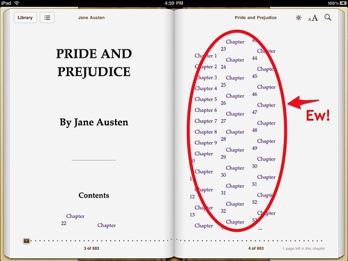
A great article about the surprising lack of typography on the Apple IPad by Stephen Coles over at FontFeed. Frankly, it's a great article about typography itself, touching on alignment, hyphenation, orphans and widows, and book faces.

Here's a bit he references about Orphan/Widow Prevention, Proper Handling of Tables and Line Breaks by Liz Castro.


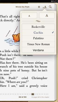
Typography on the iPadColes goes on about the choice of typefaces that the IPad offers for book reading; none, he thinks, are particularly good screenreading options (links to typefaces from original quote have been left in):

Unfortunately Apple offers just five: Baskerville, Cochin, Palatino, Times New Roman, and Verdana. Of these, I’d say Palatino is the only legitimate choice for reading a book on a screen. Some cuts of Baskerville work well in print, but its weight is far too uneven for text in pixels. Cochin reeks of a decision made by someone gawking at pretty letters rather than diving into pages of text. The web learned long ago that Times New Roman doesn’t work for text type on-screen. And Verdana? Maybe for an IKEA catalog…

What would I offer instead? Minion, FF Scala, Dante, Garamond have all proven themselves in print. And the more sturdy of these alternative typefaces for book design would perform better than Apple’s selection.

I haven't used Dante for anything...you?

Sunday, April 4, 2010

Identify that typeface

While we're on the subject of art (brilliant woman, BTW, that Andrea Deszö!), there's something I quite liked about this art invitation at the Observatory Room; obviously some of the typography could have been better, but I like the type choices (Garamond, Caslon, Letter Gothic), and the overall concept. But what is the typeface for "Entymologia"? Closes today, and sadly I didn't quite make it out to Brooklyn to see it.


In other art invite news, I loved the concept for this group show, using a diagram showing the parts of a robin for the names of the artists in the Round Robin Collective.

Saturday, March 13, 2010

Wedding Invite, German Style

Forgive the awful jpeg, but I was so interested to see this wedding invite we got from some German in-laws (via email). So very much different than American invitations...hardly any script faces!
Sadly, I don't think we can make it. And the location is so close to Mainz, too...could have had a whole tour of Gutenberg's invention of moveable type in 1455!

Friday, February 26, 2010

Shakespeare Gets the Shakes


I love the strong typography for the Public Theater's construction hoarding, but it's ironic that the sign about reporting unsafe conditions covers up most of the immortal bard's name. BTW, not surprisingly, the Public's website is astounding.

Thursday, January 21, 2010

Rave on

Yes, this album came out in 2008, but the album cover for Danish band The Raveonettes' Lust Lust Lust is just so hypnotizing. As is the album!

Thursday, January 14, 2010

So proud!

One of my Intro to Design students complained that the subtitles in the movie Avatar are in Papyrus; it detracted from her movie experience. Let's hear it for the developing critical eye!

Monday, January 4, 2010

Ampersand-errific

Love the use of the & in this art invite for Charles Dunn and Gary Rough. I keep looking at it because it kind of bothers me, and then I love it, and then it bothers me. That's good, right?

Monday, November 16, 2009

Heathens at the gate

Well, the NYTimes has posted an article about people who are "typographically sensitive" and as I write this, it is the 8th most emailed article today.

Michael Bierut, in his typically funny way says “I think sometimes that being overly type-sensitive is like an allergy; my font nerdiness makes me have bad reactions to things that spoil otherwise pleasant moments.”

The article goes on to talk about how a church near his vacation home (sigh! successful designers with vacation homes!) uses Cooper Black for their sign outside, which mars the lovely restoration. He says "Cooper Black is a perfectly good font, but in my mind it is a fat, happy font associated with the logo for the ‘National Lampoon,’ the sleeve of the Beach Boys’ ‘Pet Sounds’ album and discount retailers up and down the U.S. I wouldn’t choose it as a font for St. Agnes Church even as a joke. Every time I go by, my vacation is, for a moment, ruined.”

So I did a little googling, and here is that itch that can't be scratched:

Wednesday, September 30, 2009

Street Art

Wonderful typography, sorta reminiscent of what Paula Scher did for buildings years back. I know that's my cue to link to the Scher work, but I need to bolt. More chic street stuff: the Bowery's gone grid with this combo ad and . . . er . . . whatnot.

And, in a non-street mode, here's a moment of horn-tooting for Layout Essentials, which is now available internationally. Can you tell the country of origin by the cover?