I'm teaching Book & Magazine Design this semester, and had to share some terrific dust jackets by my students.
The assignment was to do an "observe and report" on a bookstore, and come back with two sketches of book covers they found in their bookstore—ones that caught their attention. Once back in class, they chose one of the covers to redesign. Then...to expand that cover into a full dust jacket complete with back cover, spine, and flaps.
Peter Pekalski chose to redesign Trust Me, I'm Lying: Confessions of a Media Manipulator. Instead of relying on the hard-boiled/noir comic book image, he chose to go to an all-type solution, knocking the type out over an image of a face.
Here's the original, from the bookstore (designer?):
And here's Peter's redesign.
If you look closely (click on the image for a larger view), you can see that he also extended the face onto the flap, so you get a hint of an ear. He also played with the subtitle type, splitting it and repositioning it so it's no longer smooth—it's been manipulated. Click here to see more of Peter's work.
The redesign reminds me a bit of an inverse version of Jamie Keenan's terrific design for Kazuo Ishiguro's Never Let Me Go.
Showing posts with label student. Show all posts
Thursday, September 27, 2012
Monday, July 11, 2011
Designer Quandry, Update!
Earlier this month one of my students found herself in a familiar design quandry...how to please a client who already had a design from a previous designer...discussed in this post.
Here's the update:
Here's the update:
When I met up with my client, I addressed my concerns about using the poster design [the previous design, done by another designer] as a webpage layout, and he said it was fine to do that and that the poster designer is someone who works in the same place (that's a relief!) As for the decision of whether to go with my design or the poster design, it seems like the client definitely wants to stick with the poster design. My supervisor decided if that's what the client wants, then we'll just have to go with it.
Well, I guess that's the gist of it for my first client! I was definitely paranoid about whether it was okay to just copy another design, but I'm relieved to hear that the poster design belongs to the workplace.
Thank you for posting my question on your blog. It was very helpful to read comments from people who have experienced this many times.
Thursday, July 7, 2011
Designer Quandry
A former (wonderful, thoughtful, talented) student sent me an email the other day with a classic designer's dilemma...what do you do when your client wants you to base work on another design? And how do you sell a client on your design when they love something from before?
Tricky, sticky, complicated? Thoughts, please!
Hi Professor,
I have a bit of a problem, and would like to ask you for some advice.
I recently landed a web design internship, and what I do so far is set up appointments with clients in order to get a feeling of how they would like me to design their page. I mainly do the graphics though, since my coding skills are very minimal. However, I am in a bit of a slump because my first client seems very hard to influence. He wants me to design a layout that resembles a poster that someone else designed for him. By doing so, I feel like I'll only be ripping off someone else's work and ideas.
I decided to create two drafts for the client; one draft with my own ideas, and the other draft with what he wanted to go for. I put more effort into designing my own layout because I wanted my client to consider choosing a better alternative. However, my client still wanted to go for the draft that resembled his poster.
My problem is, how do you influence clients to stray away from ripping off another design? Although the poster was designed for him by someone else, it still feels weird for me to just copy someone else's work. It also seems like he is really set on having his layout look a certain way.
Even though my supervisors prefer my design, I don't know how to get my client to consider a layout that is more practical for a webpage.
Wednesday, June 29, 2011
Gran Poder
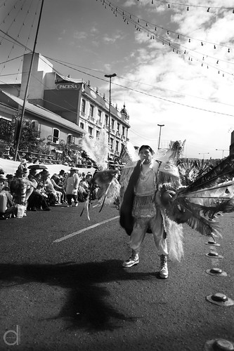
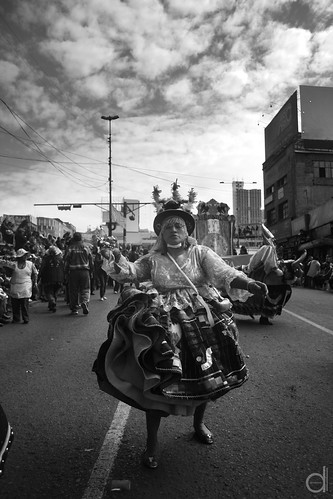
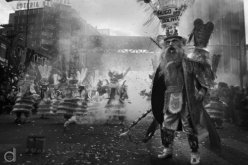
One of my former design students, Michael Dunn Caceres, is now a designer and photographer down in La Paz, Bolivia, where he took some unbelievably beautiful shots of the Fiesta del Gran Poder (Festival of the All-Powerful). The festival is a giant street party that celebrates Jesus and his part in the Trinity.
What's so cool about Michael's photographs is the use of black and white (in great contrast) for what you know is a totally colorful festival. This way his images focus on the composition and on the expressions of the celebrants. Great great stuff. More here on his flicker stream.
Now I just need to figure out which one I want a print of, and figure out how to get some South American mail! (update: they are available here, and mounted prints are well under $100! I am so getting one!)


What's so cool about Michael's photographs is the use of black and white (in great contrast) for what you know is a totally colorful festival. This way his images focus on the composition and on the expressions of the celebrants. Great great stuff. More here on his flicker stream.
Now I just need to figure out which one I want a print of, and figure out how to get some South American mail! (update: they are available here, and mounted prints are well under $100! I am so getting one!)


Tuesday, July 6, 2010
Students (Visually) Storm Times Square

Live! From New York! Today, six billboards addressing issues of tolerance premiered on Clear Channel's "Spectacolor HD" digital billboard at 47th & Broadway (above Blue Fin; on the west side of the tkts booth). Created by high school students in the AIGA/NY Mentoring Program, the billboards will be broadcast at various soon-to-be-announced times through July 31, thanks to AIGA/NY's partnership with Worldstudio and its Create/Don't Hate initiative (which is in turn a subset of "Design Ignites Change"). It truly takes a village . . . .
The chosen six billboards looked great in Times Square this hot and hazy summer morn—right up there with the great Broadway billboards by SpotCo. Shown below: Arielle posing in front of her creation.
• • •
22 of the students in the AIGA/NY program tackled the theme; all 22 billboard designs will be on display through July 22 at the (air conditioned!) AIGA National Design Center, 164 Fifth Avenue, between 21st and 22nd Streets.
Subscribe to:
Posts (Atom)