
A great article about the surprising lack of typography on the Apple IPad by Stephen Coles over at FontFeed. Frankly, it's a great article about typography itself, touching on alignment, hyphenation, orphans and widows, and book faces.
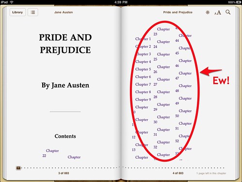
Here's a bit he references about Orphan/Widow Prevention, Proper Handling of Tables and Line Breaks by Liz Castro.
 Coles goes on about the choice of typefaces that the IPad offers for book reading; none, he thinks, are particularly good screenreading options (links to typefaces from original quote have been left in):
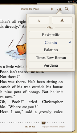
Unfortunately Apple offers just five: Baskerville, Cochin, Palatino, Times New Roman, and Verdana. Of these, I’d say Palatino is the only legitimate choice for reading a book on a screen. Some cuts of Baskerville work well in print, but its weight is far too uneven for text in pixels. Cochin reeks of a decision made by someone gawking at pretty letters rather than diving into pages of text. The web learned long ago that Times New Roman doesn’t work for text type on-screen. And Verdana? Maybe for an IKEA catalog…
What would I offer instead? Minion, FF Scala, Dante, Garamond have all proven themselves in print. And the more sturdy of these alternative typefaces for book design would perform better than Apple’s selection.
I haven't used Dante for anything...you?
1 comment:
Lately, I've heard a fair amount of discussion of type on devices. At a seminar about the future of Ebooks, where Charles Nix talked about the need for setting up Kindles and its kissin'kuzzins with better typography—including setting type flush left. Not long after, the Type Director's Club had an event about fonts on the web. The type visionary Roger Black (who was one of the responders to Liz Castro's post), showed websites from the 1990s that looked ... shall I say ... primitive. There's no easy solution to devices or sites yet, BUT it seems that it's a crucial part of the iPad etc experience. As a greater percentage of material comes to the small screen—especially the highly-visual stuff—typography just HAS to evolve.
Interesting about Dante. I was just looking at it the other day (but no, I haven't used it). I did use Minion lately on a traditional book and can see why it would be amont Castro's offerings; Minion is very sturdy and can hold its on in pixels.
Post a Comment