Some sources date Stan Davis's futuristic font back to 1964; Linotype's version is from 1965. One blogger notes that something based on, drawn to match, or related to Amelia was used for the cover of Alvin Toffler's book Future Shock, which looks shockingly dated. Other searches bring up other dates, no doubt because various foundries bought Amelia at different times. Enough!
Speaking of dating, I recall an interview that the astoundingly eloquent and prolific Steven Heller conducted with a cantankerous Paul Rand (né Peretz Rosenbam). Heller pointed out the timelessness of Rand's work and the datedness of timely work. That said, everything has an expiration date.
I love your shot of the rapidly-disappearing downtown—and feel semi-scooped by a book published by Norton that shows many endangered Brookyn storefronts (maybe it's still possible to do versions for other boroughs). Not that I want our conversation to focus solely on the already-famous, but I must note that Paula Scher's paintings evoke the world of the accomplished-but-quirky hand.
On a different, but sort of related note, I got a huge kick out of a number of unabashedly unsophisticated logos (some with hand-drawn type, some "modern") that I noticed while walking down Madison Avenue. Created, it seems, for businesses that may have been around before iconic logos and branding became as universal as they are today, they illustrate as opposed to encapsulate. They're imperfect, but I really like them.
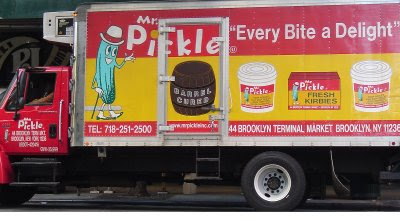
For instance, how could you not like Mr. Pickle? As charming/silly as Gumby, he makes me smile every time I see him and his barrels, buckets, and slogans on the truck in front of PJ Bernstein's Deli (which, by the way, used to have a sign with unwittingly funky typography and now has a sign with self-consciously funky typography).

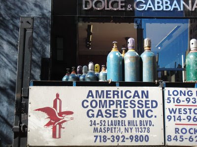
The combo of Gas and (modern) Gabbana cracked me up.

Advantage Plumbing throws in everything but the kitchen sink in its graphics.

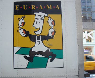
Finally, Eurama seems to be Mr Pickle's continental graphic cousin.

C'est si sorta bon!

No comments:
Post a Comment