If only I could have found Helvetica numbers! Some of the horrifying options included waxen glitter, teal polka dots, and TV characters. At least the selection was better than last year—a lot of the "1"s have weird serifs that make them look like computer "L"s. Will have to do some stealth photography to make my point, but here's
a link if you're dying to see!.
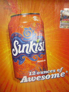
Speaking of stealth photography, some retrofuture Pepsi spotted in a Walmart, and some other kind of retrofuture Sunkist on a billboard.

I'm loving the acrylic look of these Sunkist ads, although it makes me think orange-soda-plastic-summer, perhaps not the advertiser's intention!


2 comments:
Anyone else read "Sinkist" on that logo? Not sure yet if that would make me more or less likely to drink one....
So didn't see that—but now I can't stop seeing it!
Post a Comment