
Sunday, October 31, 2010
Boo Haiku
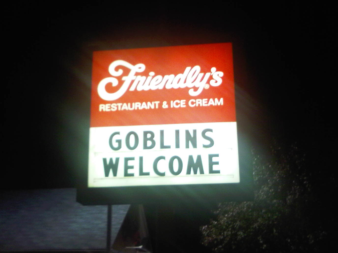
This sign may be short-lived at the neighborhood Friendly's. I'm wondering (horror movie style) what would really happen if real goblins showed up for ice cream.

Wednesday, October 27, 2010
1 or 2 of the 15 minutes of celebrity?

How fab to see the article, "Meet Suzanne Dell'Orto . . ." in the MorrisTownship-MorrisPlainsPatch. Nina's photo of her mom (Suz) is great. The work looks amazing, too—especially "DNA4". I heart this particular Dell'Orto painting as much as I heart Mark Bradford's work (logrolling, I realize).
Friday, October 22, 2010
Translated from the American
There is now a French edition of Layout Essentials: 100 Design Principles for Using Grids. My favorite part is that it was "Traduit de l'américain. . ." (par Xavier Guesnu). Can an Italian edition be in the offing?
Thursday, October 21, 2010
J
In the continuing poem that is our Friendly's sign...

But what is the mysterious J?
Some friends have already posited jalapeno, or perhaps jack?

But what is the mysterious J?
Some friends have already posited jalapeno, or perhaps jack?
Wednesday, October 20, 2010


Tuesday, October 19, 2010
Devalued
Today, while I was out of the office, a thief got past the renters at BTD and stole the MacBook Pro I use for home, for interns, for mentees, and for additional mounties when deadlines demand.
While filing a police report, I learned that what cost me $2589.01 in 2008 (or, more accurately, $1918.87 because extra memory, protection, tax, and shipping don't count) is valued at under $1000. The NYPD pointed out that 2-year old technology is worthless. The only problem is that whatever the insurance company pays, replacing the laptop will be a financial challenge.
The computer isn't the only thing that got devalued today. I was the human version of aging technology by just not getting the way police reports work. My extreme amounts of information led to the officer to note that in giving monetary values, "we don't 'pad.'" Pad? Not happy, I pointed out that I'd never pad [not even iPad, alas!] anything. I was not the thief.
Now, my challenge is return to civility—and to replace the laptop which, to me, represents more time, energy, and expertise than what insurance decrees is worth under $1000.
—B.T., newbie complainant "reporter"
Wednesday, October 13, 2010
While we're talkin' channeling
. . . In its (we heart-with-arrow) Logistics campaign, UPS seems to have appropriated Milton Glaser's "I heart" approach. I haven't done my homework to see if UPS (like JetBlue) worked with Glaser or obtained his blessing. So, I'll switch topics a tad and quote some of the eloquent text that accompanies the current exhibit of work by Milton Glaser on the mezzanine of the AIGA National Headquarters at 164 Fifth Avenue.
In Search of the Miraculous
I remember reading Ouspensky's book on Gurdjieff as a young man. I found it strangely unpleasant and unconvincing for reasons I don't understand, but the phrase "In Search of the Miraculous" has persisted in my memory. One could easily say that all human experience is a miracle: memory, color, taste, walking, skin, affection, Vermeer, stars, watermelon and so on. For those of us in and around the arts, the act of making things that move the mind is our deepest aspiration in regard to miracles.
What inspiration—not to mention generosity—from the man who's been visually quoted by millions.
While I'm using UPS and Milton Glaser in the same sentence, at the exhibit opening last night, my colleague Frank Baseman called attention to a Design Observer article by the inexhaustible and brilliant team of Jessica Helfand and William Drenttel. Their post shows the original UPS pictograph as well as the evergreen Glaser logo as examples of iconic design. The article is a good primer for students and practitioners alike. The comments are as informative as the article itself.
Wednesday, October 6, 2010
When advertising goes astray
Is Allstate trying to be grungy for their new ad campaign?

Oh no! They're trying to channel Saul Bass!

Poor Saul Bass!
What does the legendary graphic designer (AT&T logo, Exxon logo, Girl Scouts logo, Kleenex, Minolta, United Airlines...!) and film title designer (Psycho, Vertigo, The Man With the Golden Arm, Casino) have to do with insurance!?


Oh no! They're trying to channel Saul Bass!

Poor Saul Bass!
What does the legendary graphic designer (AT&T logo, Exxon logo, Girl Scouts logo, Kleenex, Minolta, United Airlines...!) and film title designer (Psycho, Vertigo, The Man With the Golden Arm, Casino) have to do with insurance!?

Boulderado for ya

I loved the Boulderado's matchbook, which you brought to the office when you participated in a wedding years back and was amused to spot it on a quick zip through the city. Boulder's first luxury hotel, which opened on New Year's Day in 1909, has a great, evocative, logo.

The Boulder Theater opened as an opera house in 1906 (probably to entertain the good folks staying at the Boulderado)—but RObert Boller's 1936 Art design sports terra cotta, glass, and tile ornamentation to beat the band—i.e. the many bands that now play at the venue. In a People's Choice-like move, in the 1030s, the theater got the community involved:
Before the opening a contest was held through the local newspaper to name the theater. The winning name was "The Boulder", with the entrant receiving a one year pass to the theater.
I personally prefer the name of the Boulderado, but it was already taken for the hotel.
Sunday, October 3, 2010
The Accessible Dream

With Pat's broken foot, I didn't want to risk any further injury in an unknown room out of town, so we made sure to get an Accessible Room. The spacious bathroom seemed very safe, with a bench and railings in the shower and railings everywhere in the bathroom, I felt less worried about Pat slipping and halting recovery. The hotel room's art even echoed Pat's crutches. Coincidence?

Friday, October 1, 2010
American Nomads

Mirage? Bedouin tents? Nope. It's the Denver International Airport's white tensile fiberglass rooftops, designed to echo the snow-capped winter Rockies. The design was begun by Perez Architects and completed by Fentress Bradburn Architects.


Branding Aloft
Target seen from a plane leaving the Minneapolis airport.

Nuts to you. Snacks—not meals. The medium for the Hilton Garden Inn is a package-o-peanuts.

Soft drinks brought to you by Delta and Coca Cola.


Nuts to you. Snacks—not meals. The medium for the Hilton Garden Inn is a package-o-peanuts.

Soft drinks brought to you by Delta and Coca Cola.


Subscribe to:
Posts (Atom)