A few years back, the phrase "girl crush" came to the fore. Well, I have a girl crush on Marina Abramovic. "Girl crush" is way too vapid a reaction to the self-described "Grandmother of Performance Art," who remains silent throughout the hurlyburly—or whose pieces help cause the hurlyburly—of her MoMA performance (the nude performers standing in for Abramovic and Ulay on the top floor are fascinating on a number of levels). Back to the crush: what really strikes me is Abromovic's fearlessness. Even the literally cleaned up cow bones at MoMA's presentation of "Balkan Baroque"—done originally and in the stinky flesh for the 1997 Venice Biennale—are alarming, disgusting, provocative, brilliant, and successful in making a point. Some of Abramovic's pieces are weird, some scary, and some are downright goofy to me, but all are done with conviction and concentration.
I didn't see the exhibit "American Stories: Paintings of Everyday life, 1765–1915," but I did pick up the Family Guide for the exhibit when I popped in to see the (amusing, sociological, and silly-ish) Victorian collages. The strong, sans serif graphic muscularity of the Family Guide for "American Stories" surprised me—happily so. The bold design both grabs attention and signals that museums are lively. I'd love to know what Marla thinks about how kids might react to this family guide in particular and any other guides in general.
Judson Memorial Church on Washington Square South had this funeral announcement posted for the playwright Harry Koutoukas who died on March 6 at the age of 72.
Bits of paper on a construction fence turn out to be a a variation on a sniper wall for "Exit Through the Gift Shop." Banksy has moved from walls to silver screen!
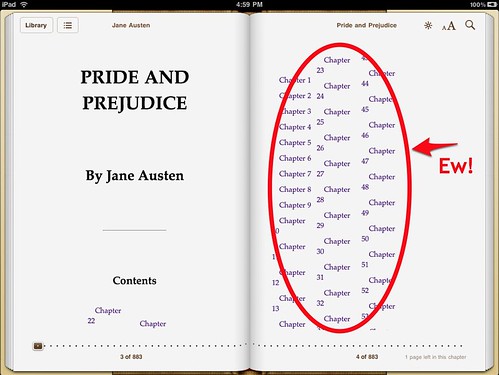
A great article about the surprising lack of typography on the Apple IPad by Stephen Coles over at FontFeed. Frankly, it's a great article about typography itself, touching on alignment, hyphenation, orphans and widows, and book faces.
Here's a bit he references about Orphan/Widow Prevention, Proper Handling of Tables and Line Breaks by Liz Castro.
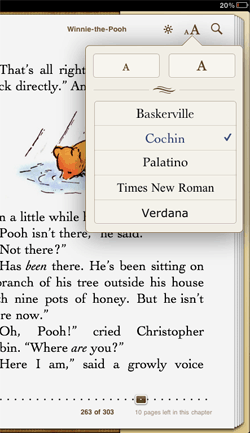
Coles goes on about the choice of typefaces that the IPad offers for book reading; none, he thinks, are particularly good screenreading options (links to typefaces from original quote have been left in):
Unfortunately Apple offers just five: Baskerville, Cochin, Palatino, Times New Roman, and Verdana. Of these, I’d say Palatino is the only legitimate choice for reading a book on a screen. Some cuts of Baskerville work well in print, but its weight is far too uneven for text in pixels. Cochin reeks of a decision made by someone gawking at pretty letters rather than diving into pages of text. The web learned long ago that Times New Roman doesn’t work for text type on-screen. And Verdana? Maybe for an IKEA catalog…
Speaking of hand skills as we were . . . the ultimate moment in art/design made by hand is at The Morgan Library & Museum where "Demons and Devotion," an exhibit about The Hours of Catherine of Cleves, is on display through May 2. The Master of Catherine of Cleves created other manuscripts, but he's most famous for Catherine's book (I have yet to learn if he had his own real name). The Master must have had infinite patience—or assistants—to make so many pages with such extraordinary detail. The Hours is astonishing, humbling, and inspiring. Each page is full of symbols as well as domestic scenes that paint a clear picture of 15th century life in the Netherlands.
The surprise for me in this charming scene of the Holy Family at Work is the cool baby-walker.
If you can't get to the Morgan, have an online look at curator Roger Wieck's rich and witty interactive tour of The Hours. . . . The section named "Suffrages" contains the most delightful scenes (a fish border painted on silver foil is an early multi-media presentation).
On the page for St. Lawrence, the afore-mentioned fish appear in the border, while a well-prepared saint brings his own grill (actually, the grill is not for the fish but to signify the instrument of St. Lawrence's martyrdom). The video enables you to see the work close up as opposed to leaning over the vitrines and trying not to either break or fog up the display.
Catherine was quite the tough dame; she spent most of her life warring with her husband. Wieck points out that Catherine committed a heraldic no-no when she incorporated her father's—instead of her husband's—crest into one of the illustrations. No one was the boss of her. I wonder how much say The Master of Catherine of Cleves had about his rather major contribution to the book. Of course, the times warranted various strictures and structures aside from the wishes of the "client." My guess is that the Master didn't have a lot of freedom. Was Catherine a demon about her book of devotions?
Curator Wieck is particularly droll when describing the image above. Note the scrolls of sacred conversation.
I'm always going on about how I love to make information clear, but the interactive Brain Tour on the Alzeimher's Association site really breaks complex material into understandable parts. Also, the tour section of the site proves the educational dictum that pictures with words are a lot easier to "get" than are words alone.
I've read about neurons and plaques (abnormal clusters of protein fragments that build up between nerve cells), but the material hasn't stuck in my brain (bad play on words sort of intended) until now. Thanks to a clear and sometimes beautiful interactive lesson, I'm beginning to understand. Although the typography is bland-to-ugly, it serves the site—and probably works on as many computer systems as possible (Noah, did I get that right?).
The neuron forest reminds me of the movie "Avatar," without the Papyrus subtitles, of course.
Screenshots shown here are screen shots from the Alzheimer's Site.
To put it more accurately, in this case it's a tape of evil. Hand-formed letters announcing a store on Bond Street show that evil can be good.
It appears that more and more designers—boldface-and-regularly-set names or not—are longing for the hand-made—and are reacting to bevels and shadows and "canned" aspects of work (I can't very well write canned "qualities" can I?). On April 6, in an inspiring eve put on by SVA's D|Crit Program, Brian Collins and his guys touched on how a client (Mott's, to name names) told them that "the slickness of our packaging is killing the craftsmanship of what it takes to make our product." One of of the key approaches that the Collins creative team discussed was "personal and quirky." So, not surprisingly, the end result of the thoughts and work by heady team at Collins: is smart and...well... personal, quirky, and simultaneously sleek (which is not at all the same as slick). For the record, one of my fave Collins projects was the CNN Grill at the 2008 Denver convention.
Recently, Pat attended an expostition called "Let's Eat," where food companies showed new products. I was amused to see that a lot of snacks are being marketed as organic health food, complete with corrugated cardboard packaging. Craft paper and raffia are still the big signals that something is organic. As for the food, I've dubbed the "organic" sweets "Fauxganics." Full disclosure: I did eat a lot of the goodies—and everything was yummy, especially the naughtiest sweetest snacks.
The other trend seemed to be the informational takeaways. A number of exhibitors put their PR info on Flash drives. Informational and recyclable. The cow in this shot is the handle portion of an ice cream scoop (Moo-p?). Combined with the Flash drive, it's an amusing (if a bit cheesy) blend of hand and digital technology
The alarm red of the "DENIED / State Supreme Court judge overturns the city's decision to close 19 schools" caught my eye, but the zebroid hand-drawn "PUSH" at this construction site kept me looking. The next time I walk by, I'll have to see if I can find out who made push come to life. Architect? Store owner? Construction person?
There are metaphors a-go-go in this invite to an evening of readings with a live sound score to benefit Elevator Repair Service. Matthew Diffee's "Tape on Books," and Maggie Hoffman's graphic design reinforce books, tape, reading, and the importance of handicraft, not to mention stage craft. Me, I'm not wild about the typography, being uptight and all, but my reaction doesn't matter; the approach is perfect for ERS.
We've all seen the peeps in the microwave, and checked out the peep diorama contest in the Washington Post, but have you ever seen peep sushi (also known as Peepushi)? The rice is Rice Krispie treats, and the nori is fruit leather.
Brilliant! Conceived and created by Russ Marchand, who is the self-proclaimed child of Wink Martindale and the Devil!
While we're talking about shows that are no longer up, my entry is about a Good Friday jaunt to the Brucennial (art = religion?). The Bruce High Quality Foundation doesn't lack self-confidence; the site notes that the Brucennial is "The Bruce High Quality Foundations's signature public program, as well as the most important survey of contemporary art in the world ever." Ever!
What's cool to me is that instead of waiting for traditional museums and curators to recognize them, a group of relatively young artists have taken charge of their careers and curated themselves. Such self-starting puts me in mind of youngish designers who make and sell their own products instead of waiting for clients or producers or talking about making and selling same. In the case of the Brucennial, it doesn't hurt to be the son of a famous older artist. That said, I give major props to Vito Schnabel and his collaborative Bruces. Not surprisingly, some of my favorite moments in the show are more graphic than anything else.
Above: A graffiti-like moment; artists's names are handwritten on the wall. The lack of typeset labels implies an ad hoc show. Sebastian Black is on the left; Julian Schnabel is on the right (the spray paint-like circles/arrows are mine). Below: totally unrigorous, I didn't note the names of the artists featured in the next three shots. I especially got a kick out of the book-art in the bottom-most shot, including an apparent nod to Ed Ruscha.
Scenario: a cruise through the grocery store. Sighting: death knell for the cans of Coco Lopez. While I admire the "thinking outside the box" (please excuse this tired phrase) of the packaging, I wonder if this is really necessary. Cans of cream of coconut are recyclable (and this plastic is not) and you can get every last bit out with a spatula.
So does the upside-down dispenser really improve this product for the competitor Coco Real? I suppose if you only wanted to make one piña colada it would be useful to have a container that you can close and put away in the fridge. But piña colada for one doesn't sound very fun, even if you only have to "simply squeeze".
While we're on the subject of art (brilliant woman, BTW, that Andrea Deszö!), there's something I quite liked about this art invitation at the Observatory Room; obviously some of the typography could have been better, but I like the type choices (Garamond, Caslon, Letter Gothic), and the overall concept. But what is the typeface for "Entymologia"? Closes today, and sadly I didn't quite make it out to Brooklyn to see it.
In other art invite news, I loved the concept for this group show, using a diagram showing the parts of a robin for the names of the artists in the Round Robin Collective.
"Sometimes in my dreams I fly." Now there's a line that has me wanting to know and see more.
My friend Andrea Deszö has created an installation for the Rice Gallery in Houston, Texas. The mega-tunnel book installation runs from 8 April through 8 August 2010.
According to the poster, the show is "Inspired by Dezso's childhood dreams of space travel, and by an event synonymous with Houston, the failed Apollo 13 mission (1970)." It promises to be out of this world. My quickie shot of the poster that arrived in the mail doesn't do the art justice. Andrea is so eloquent that below, I'm extracting a lot of the poster's text.
Andrea Dezsö evocatively states:
I grew up in Transylvania, Romania, and as a child I was very interested in space exploration and the space race that took place between American and the Soviet countries . . . . The whole business seemed very heroic and unprecedented, and it just filled us children in the Eastern Block countries with a new kind of hope. Our imagination was really captured by how these men were exploring places where no one has been before. Because we did not have passports and could not go anywhere from Communist Romania, travel was only possible in your mind. . . .
What captured my imagination is how not being able to go somewhere physically opens the possibility of epic mental Odysseys, and how we can stuff empty space full with rich imaginary worlds, then move in.
Andrea has herself explored and colonized new worlds of artistry. Although she's now able to go places physically, she's still traveling on epic mental and artistic Odysseys. And speaking of heroism, Andrea's childhood memories of space heroes give them mythic status. I wish that Buzz Aldrin, whose biography is astoundingly accomplished and not just for walking on the moon, hadn't demythologized himself in the last few weeks by appearing on Dancing With The Stars. As for not mentally leaving home, I'm struck by how Andrea's stylized spaceships evoke not only Houston, but also NYC's Chrysler Building (perhaps I'm being too Manhattan-centric).
Derek Sivers presented this fascinating video at TED about leadership, lone nuts, and first followers. Thanks to Marla McLean, an artist and educator with an outstanding blog about creativity and education.
Transcript:
If you've learned a lot about leadership and making a movement, then let's watch a movement happen, start to finish, in under 3 minutes, and dissect some lessons:
A leader needs the guts to stand alone and look ridiculous. But what he's doing is so simple, it's almost instructional. This is key. You must be easy to follow!
Now comes the first follower with a crucial role: he publicly shows everyone how to follow. Notice the leader embraces him as an equal, so it's not about the leader anymore - it's about them, plural. Notice he's calling to his friends to join in. It takes guts to be a first follower! You stand out and brave ridicule, yourself. Being a first follower is an under-appreciated form of leadership. The first follower transforms a lone nut into a leader. If the leader is the flint, the first follower is the spark that makes the fire.
The 2nd follower is a turning point: it's proof the first has done well. Now it's not a lone nut, and it's not two nuts. Three is a crowd and a crowd is news.
A movement must be public. Make sure outsiders see more than just the leader. Everyone needs to see the followers, because new followers emulate followers - not the leader.
Now here come 2 more, then 3 more. Now we've got momentum. This is the tipping point! Now we've got a movement!
As more people jump in, it's no longer risky. If they were on the fence before, there's no reason not to join now. They won't be ridiculed, they won't stand out, and they will be part of the in-crowd, if they hurry. Over the next minute you'll see the rest who prefer to be part of the crowd, because eventually they'd be ridiculed for not joining.
And ladies and gentlemen that is how a movement is made! Let's recap what we learned: If you are a version of the shirtless dancing guy, all alone, remember the importance of nurturing your first few followers as equals, making everything clearly about the movement, not you.
Be public. Be easy to follow!
But the biggest lesson here - did you catch it?
Leadership is over-glorified.
Yes it started with the shirtless guy, and he'll get all the credit, but you saw what really happened: It was the first follower that transformed a lone nut into a leader. There is no movement without the first follower.
We're told we all need to be leaders, but that would be really ineffective.
The best way to make a movement, if you really care, is to courageously follow and show others how to follow.
When you find a lone nut doing something great, have the guts to be the first person to stand up and join in.


 Coles goes on about the choice of typefaces that the IPad offers for book reading; none, he thinks, are particularly good screenreading options (links to typefaces from original quote have been left in):


